Table of Contents
- The brief: a retailer buried in spreadsheets
- The data: 500 orders, 1,500 line items, one dataset
- First look: what the raw data actually looks like
- The cleaning process: one fix that mattered more than all the others
- Modeling the data: building a star schema
- The brains of the dashboard: eleven DAX measures
- The dashboard: Sales Performance Overview
- What the numbers actually say
- The verdict: what this project delivers
The brief: a retailer buried in spreadsheets
Picture a mid-size multi-category retailer — electronics, furniture, clothing — selling across nineteen Indian states through five different payment channels. Every month, someone exports two flat files from the order system and is expected to answer, from memory or a pivot table: which category is actually profitable? Which states are carrying the business? And — the question that usually gets skipped — how many orders are we quietly losing money on?
That’s the brief this project answers: turn two disconnected transactional exports into a single, filterable Sales Performance Dashboard that a manager can open, glance at for ten seconds, and trust.
Don’t want to dig through Power Query steps and DAX right now? This one-page overview covers what the dashboard does and what it found, with the report itself, in about two minutes.
The data: 500 orders, 1,500 line items, one dataset
The source is a public two-table order export from Kaggle (“Online Sales Data”), split across two files that mirror a real order-management system:
raw_sales_orders.csv(originallyOrders.csv) — 500 rows, one per order: Order ID, Order Date, Customer Name, State, City.raw_order_line_items.csv(originallyDetails.csv) — 1,500 rows, one per product line: Order ID, Amount, Profit, Quantity, Category, Sub-Category, Payment Mode.
The two files share an Order ID — an average of three line items per order — which is exactly the one-to-many relationship a proper data model needs to be built around, rather than flattened into one wide, repetitive table.
First look: what the raw data actually looks like
Before any cleaning, both files land in Power Query typed as plain ABC Text — including the amounts, the quantities, and the dates. Nothing is aggregatable and nothing is trustworthy yet.
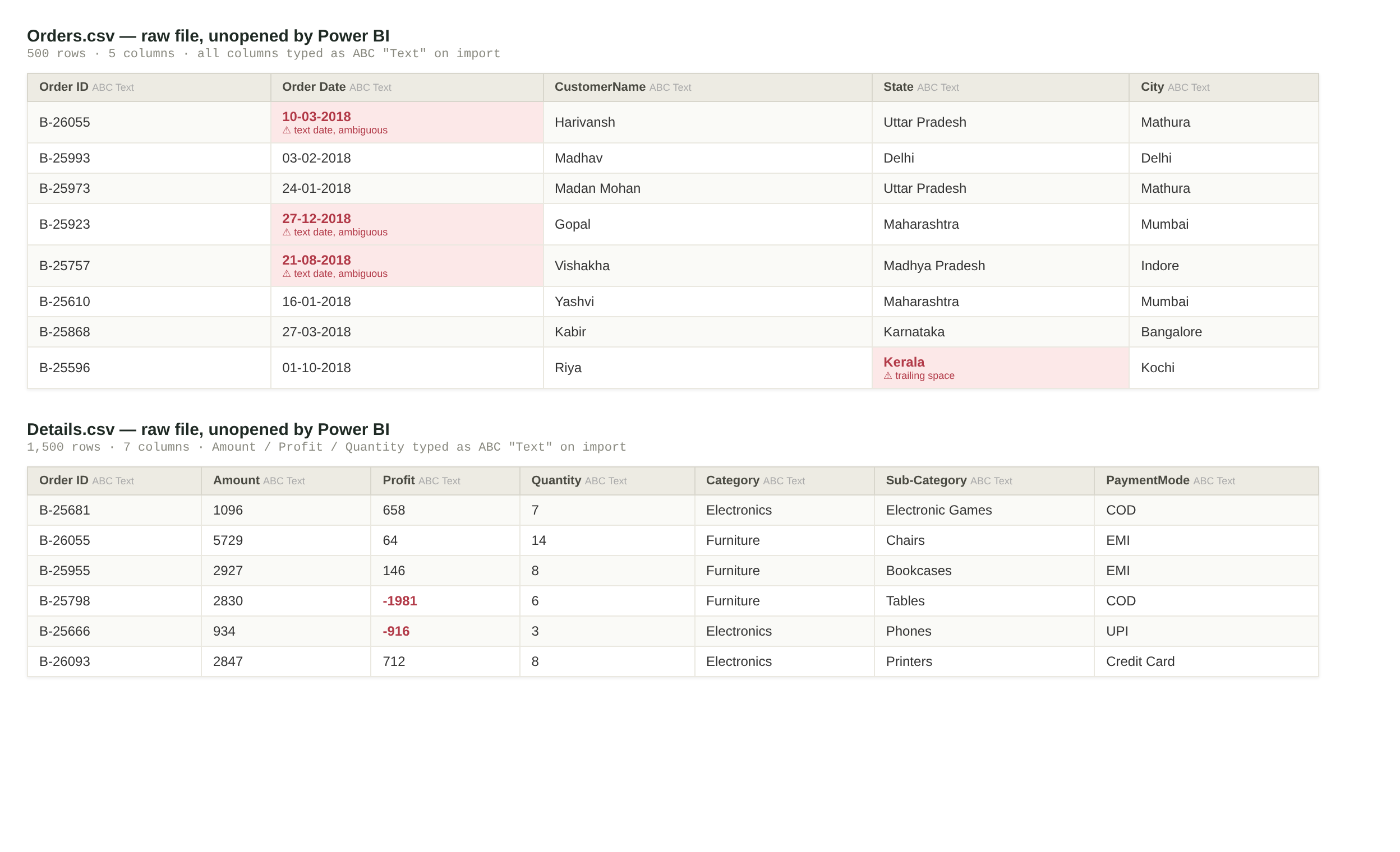
A quick profiling pass on the raw files turned up:
- Zero missing values across both files — a clean export, at least on that front.
- Zero exact duplicate rows — no line-item was accidentally exported twice.
- One quiet data-quality flaw: 16 of the 500 orders carry the state value
"Kerala "— with a trailing space. It doesn’t fracture the reporting today (there’s no clean"Kerala"value competing with it), but it’s exactly the kind of invisible character that silently breaks aGROUP BYor a slicer match the moment a second, cleaner data source gets merged in. Flagged for the next data refresh. - A landmine in the date column — covered in detail below, because it’s the most important fix in this entire project.
The cleaning process: one fix that mattered more than all the others
Most of the “cleaning” here wasn’t about missing values or duplicates — the raw export was already fairly disciplined. It was about correctly interpreting data that was typed correctly but read wrong.
1. Promote headers, then type the numbers. Amount, Profit, and Quantity arrive as text and get cast to Currency and whole-number types respectively — a normal, low-risk step.
2. The Order Date trap. Every date in Orders.csv is stored as plain text in DD-MM-YYYY format — e.g. "27-12-2018". Power BI’s default locale for casting a text column to a date is en-US, which reads that same string as MM-DD-YYYY. Run the numbers on this dataset and the trap becomes obvious:
Under en-US (MM-DD-YYYY) |
Under fr-FR (DD-MM-YYYY) |
|
|---|---|---|
Dates where the day exceeds 12 (e.g. 27-12-2018) |
307 of 500 rows (61.4%) throw a parsing error — there is no 27th month | Parsed correctly as December 27 |
Remaining 193 rows (day ≤ 12, e.g. 10-03-2018) |
Parse silently — but as March 10 instead of the correct October 3 | Parsed correctly as October 3 |
In other words: left on the default locale, six out of ten rows would have failed outright, and the other four would have been silently wrong — day and month swapped, with no error to catch it. The fix is a single, deliberate step in the M query: cast the column to type date under the fr-FR locale instead of the workbook default, since French date formatting also reads day-before-month.
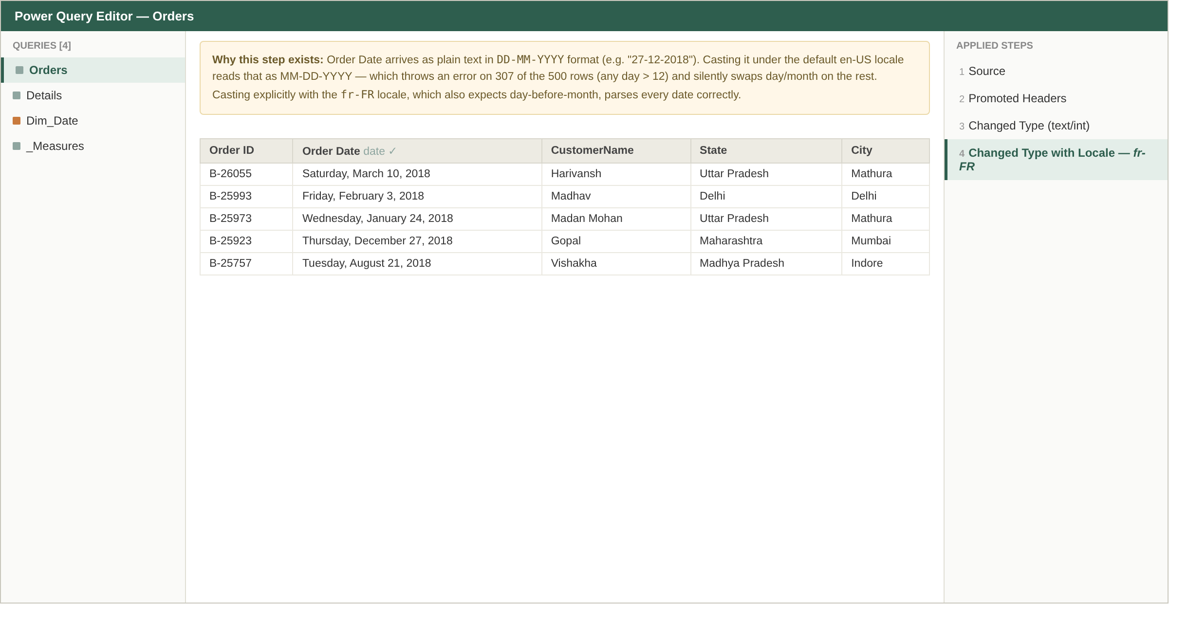
That single step is the difference between a dashboard with a broken monthly trend line and one that can be trusted.
Modeling the data: building a star schema
With both tables typed correctly, the next decision was not to merge them into one flat table. Keeping Orders (grain: one row per order) and Details (grain: one row per product line) as separate fact tables — joined on Order ID — avoids duplicating customer and location data across every line item, and keeps both grains available for the right kind of aggregation.
A calculated Dim_Date table was added on top, spanning the full order date range, to unlock real time-intelligence: year, quarter, month name, a sortable Year-Month key, and weekend/current-period flags — none of which exist naturally in a raw date column.
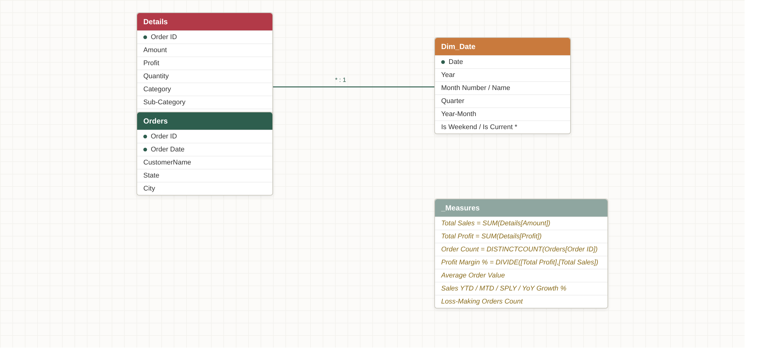
Details[Order ID] → Orders[Order ID] (many-to-one), and Orders[Order Date] → Dim_Date[Date] (many-to-one) — a small but genuine star schema.
The brains of the dashboard: eleven DAX measures
All of the dashboard’s numbers are centralized in a dedicated _Measures table rather than scattered across visuals — a habit that pays off the moment a formula needs to change in one place instead of six. The core set:
| Measure | Logic |
|---|---|
| Total Sales | SUM(Details[Amount]) |
| Total Profit | SUM(Details[Profit]) |
| Profit Margin % | DIVIDE([Total Profit], [Total Sales]) |
| Order Count | DISTINCTCOUNT(Orders[Order ID]) |
| Average Order Value | DIVIDE([Total Sales], [Order Count]) |
| Sales YTD / MTD | TOTALYTD / TOTALMTD over Dim_Date[Date] |
| Sales Same Period Last Year | SAMEPERIODLASTYEAR |
| YoY Growth % | Current vs. same-period-last-year, as a % |
| Loss-Making Orders Count | DISTINCTCOUNT of orders where Profit < 0 |
That last measure is the one that turns the dashboard from a reporting tool into a diagnostic one — it’s what powers the flagged table at the bottom of the report.
The dashboard: Sales Performance Overview
Everything above exists to feed a single page, designed to answer the brief’s questions in one screen, filterable by year and category.
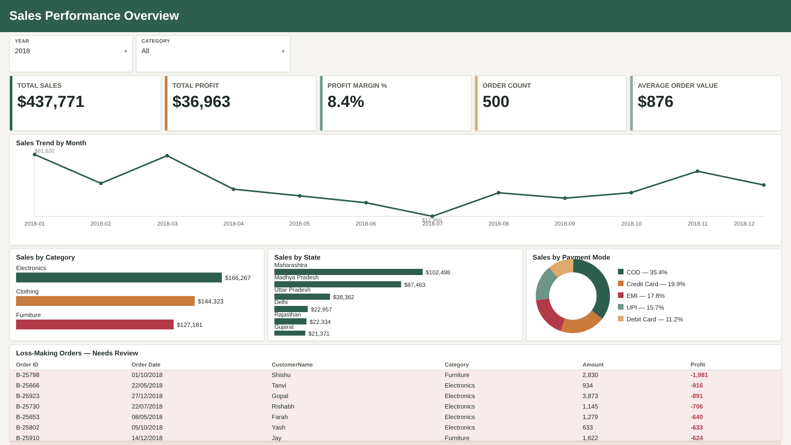
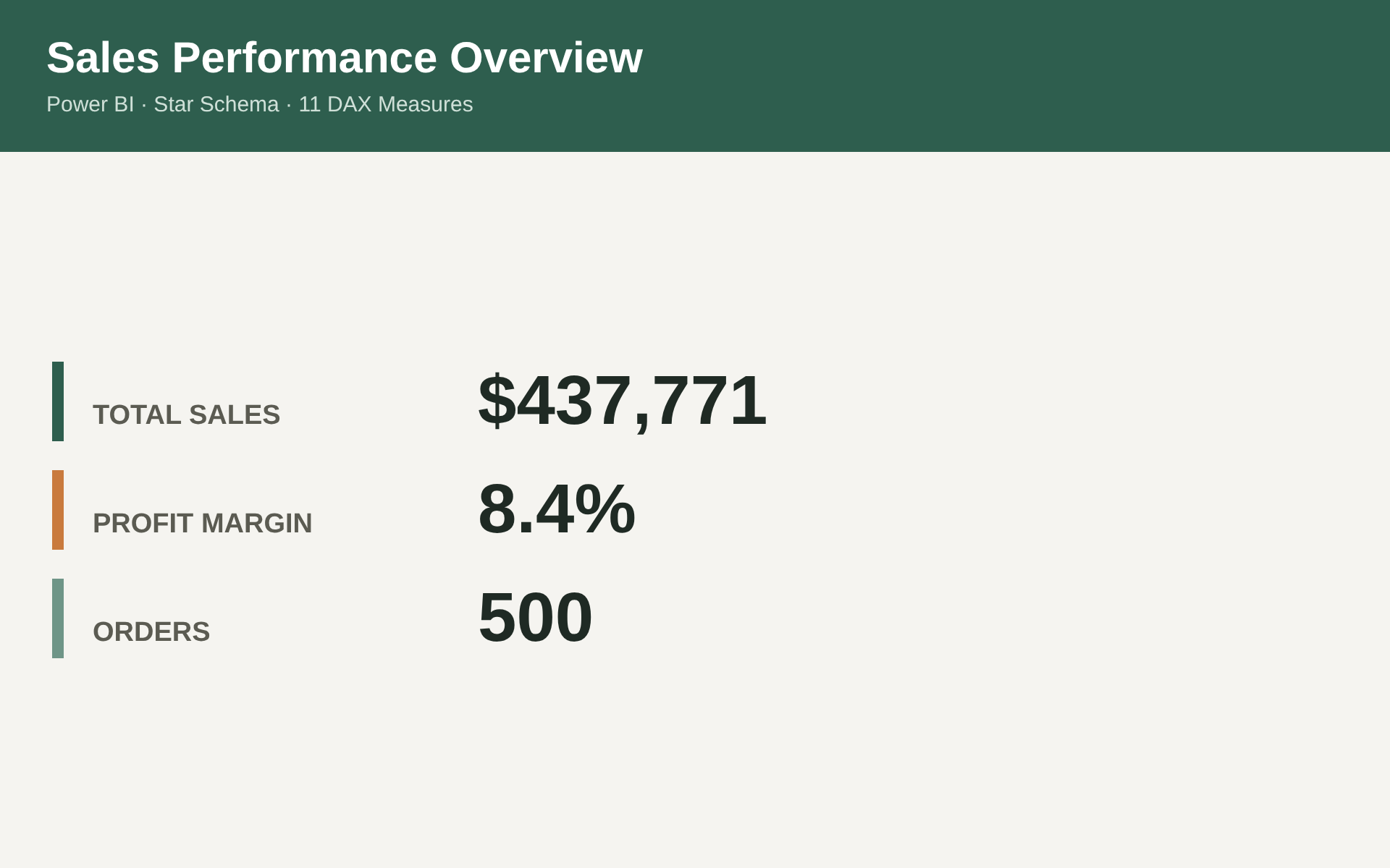
KPI row. Five cards keep the headline numbers always visible, regardless of what’s filtered below: $437,771 in total sales, $36,963 in total profit, an 8.4% blended profit margin, 500 distinct orders, and an $876 average order value.

Sales trend by month. A full year (2018) of monthly sales, immediately showing the shape of demand: a strong Q1 open, a mid-year trough in July, and a rebound into Q4.

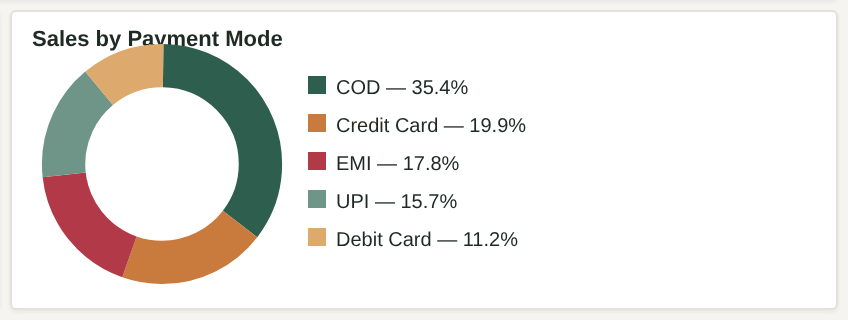
Category, state, and payment breakdowns. Three side-by-side visuals slice the same $437,771 three different ways — by product category, by geography, and by how customers pay.

Loss-making orders — needs review. The table every retailer’s finance team actually wants: every line item where Profit < 0, sorted for review, with a conditional red highlight so it can’t be scrolled past by accident.

What the numbers actually say
Pulling the dashboard’s own output together into a short read:
- Electronics leads on revenue ($166,267) but the margin story doesn’t stop there. Clothing ($144,323) and Furniture ($127,181) are close behind — this is not a business with one dominant category, it’s three roughly comparable ones, which matters for how inventory and marketing budget get split.
- Two states carry disproportionate weight. Maharashtra ($102,498) and Madhya Pradesh ($87,463) together account for 43% of total sales despite being 2 of 19 states — a concentration worth flagging to anyone planning regional expansion or logistics.
- Cash on Delivery still dominates, at 35.4% of sales — ahead of Credit Card (19.9%), EMI (17.8%), UPI (15.7%), and Debit Card (11.2%). For a business thinking about payment-processing costs or cash-flow timing, that’s a meaningfully different risk profile than a card-first customer base.
- The uncomfortable number: nearly half of all orders lose money on at least one line item. 529 of 1,500 line items (35.3%) — spread across 248 of the 500 distinct orders (49.6%) — carry negative profit. That’s the number the
Total ProfitKPI alone would never surface, and exactly why the Loss-Making Orders table exists as a standing fixture on the page rather than a one-off query.
The verdict: what this project delivers
The end result isn’t just a pretty report — it’s a data pipeline where every number on the page can be traced back to a specific, auditable transformation: a locale-aware date cast that prevented 61% of the dataset from silently corrupting, a star-schema model that keeps order-level and line-item-level analysis both possible, and a measures layer that turns “what’s our profit” into “which 248 orders should we actually be looking at.” That’s the difference between a dashboard that looks good in a screenshot and one a business can actually run on.
Stack: Power BI Desktop (PBIP source-controlled format) · Power Query (M) · DAX · Git for version control of the report definition.
Source data: “Online Sales Data” (Kaggle) — two-table CSV export of retail orders and order line items.